
Choosing the right color for your wedding decoration isn’t just about what looks pretty-it’s about setting the mood, matching your style, and making sure everything feels like wedding decoration colors that belong together. Too many couples pick a color because it’s trending, then realize halfway through the planning that it clashes with their venue, their dress, or even their own gut feeling. The truth? There’s no single "best" color. But there are colors that work better than others, depending on your season, venue, and vibe.
What Your Venue Says About Your Color Choices
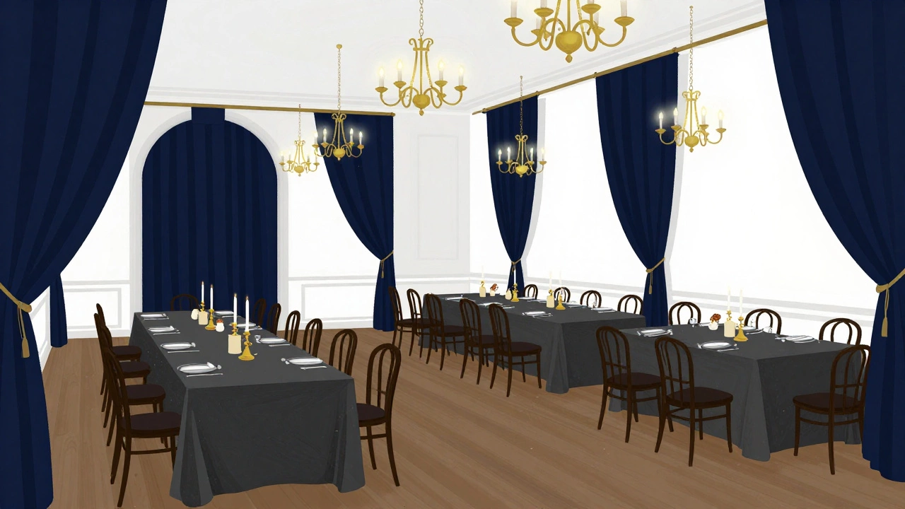
Your venue isn’t just a backdrop-it’s a partner in your color story. A rustic barn with wooden beams and exposed brick? You don’t need to drown it in pastels. Soft creams, warm terracotta, or deep forest green will let the space breathe. On the flip side, a sleek ballroom with white walls and chandeliers? That’s your blank canvas. Navy, gold, or even charcoal can pop beautifully without overwhelming the space.
One couple I worked with in County Wicklow picked blush pink because it was "romantic." But their venue had dark oak floors and heavy velvet curtains. The result? The pink looked washed out and confused. They switched to rust and olive, and suddenly everything felt intentional. The colors didn’t just match-they talked to each other.
Seasons Matter More Than You Think
Spring weddings don’t have to be all pastels. Think about what’s actually blooming. In March, you’re not seeing cherry blossoms-you’re seeing bare branches, early daffodils, and muddy paths. A palette of cream, sage, and pale grey feels more authentic than baby blue and lavender. Fall? Forget orange and brown clichés. Deep plum, burnt umber, and copper have depth. They don’t scream "autumn," they whisper it.
Winter weddings get a bad rap. People think they have to go icy blue and silver. But a warm ivory, burgundy, and gold combo feels cozier than a snow globe. I’ve seen winter weddings in Dublin with candlelight, wool blankets, and dark wood tables-and the colors made it feel like a storybook, not a holiday card.
What Colors Actually Work Together
Here’s the secret: most successful wedding palettes use three colors max. One dominant, one secondary, and one accent. Too many colors turn your wedding into a confused art project.
- Dominant (60%): The main color that covers walls, linens, drapes. Think ivory, charcoal, sage, or navy.
- Secondary (30%): Supports the dominant. It’s the color of table runners, bridesmaid dresses, or centerpieces. Try mustard, dusty rose, or deep teal.
- Accent (10%): The pop. Metallics, bold florals, or a single shade like emerald or rust. This is where you add candle holders, signage, or shoe details.
For example: Dominant = Cream, Secondary = Terracotta, Accent = Brass. Simple. Elegant. Timeless. And it works whether you’re in a garden, a church, or a converted warehouse.
Colors That Are Overused (And Why to Skip Them)
Some colors are so common they’ve lost their magic. Here’s the shortlist:
- Pink (especially hot or neon): It’s everywhere. And unless you’re throwing a 90s-themed party, it reads as childish or dated.
- Light blue: It’s the new beige. It doesn’t add emotion-it just blends in. Unless your theme is "beachside hospital," skip it.
- White-on-white: This sounds elegant, but it’s a nightmare. White tablecloths, white chairs, white flowers? You’ll look like you forgot to plan. Add texture, shadow, or one deep tone to ground it.
There’s a reason you don’t see luxury hotels or high-end restaurants using these combos. They’re visually flat. Your wedding should feel alive, not like a catalog.
Real Examples That Actually Worked
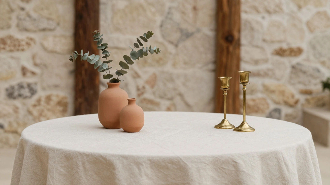
A couple in Galway chose a palette of slate grey, cream, and rust. They used grey linen napkins, cream candles, and rust-colored dried eucalyptus in vases. No flowers. No glitter. Just texture, warmth, and quiet elegance. Guests kept saying it felt "like a magazine spread," even though they spent less than €500 on decor.
Another one in Cork picked deep green (think forest floor) with gold accents. They used potted olive trees, brass candlesticks, and handwritten menus on kraft paper. It felt luxurious without being flashy. The groom wore a navy suit. The bride wore ivory lace. Everything clicked.
These aren’t fancy budgets. They’re smart choices.
How to Test Your Color Before You Commit
Don’t just pick a color from a Pinterest board. Do this:
- Grab fabric swatches (linen, velvet, silk) in your top 3 choices.
- Place them next to your venue’s natural colors-walls, floors, windows.
- Take photos in natural light at different times of day.
- Ask three people who don’t know you: "Which one feels like a wedding?"
Most people pick the color that feels calm, not loud. The one that doesn’t make them squint. The one that makes them say, "I could live here." That’s your winner.
What About Metallics?
Metallics aren’t colors-but they’re powerful tools. Gold, brass, copper, and even matte black can elevate a simple palette. But use them like salt: a sprinkle, not a dump.
Brass candle holders? Perfect. Brass table numbers? Elegant. Brass everywhere? Overkill. One or two pieces with texture and weight do more than a hundred cheap ones.
And skip silver unless you’re going for a sci-fi theme. It’s cold. It reflects too much. It looks like a discount store.
Final Rule: Let Your Heart Decide
There’s no rulebook for love. If you’ve always loved burgundy, and it makes your heart skip when you see it-go with it. If you’ve been dreaming of a lavender garden since you were ten-make it happen. Trends fade. Emotions last.
The best wedding decoration colors are the ones that make you stop and smile when you walk into the room. Not because they’re Instagram-worthy. But because they feel like you.