Wedding Elegance Estimator
Assess your current wedding decor plan or visualize potential improvements. Adjust the sliders below to see how specific design choices impact the overall "Classy Score."
Design Parameters
Your Classy Score
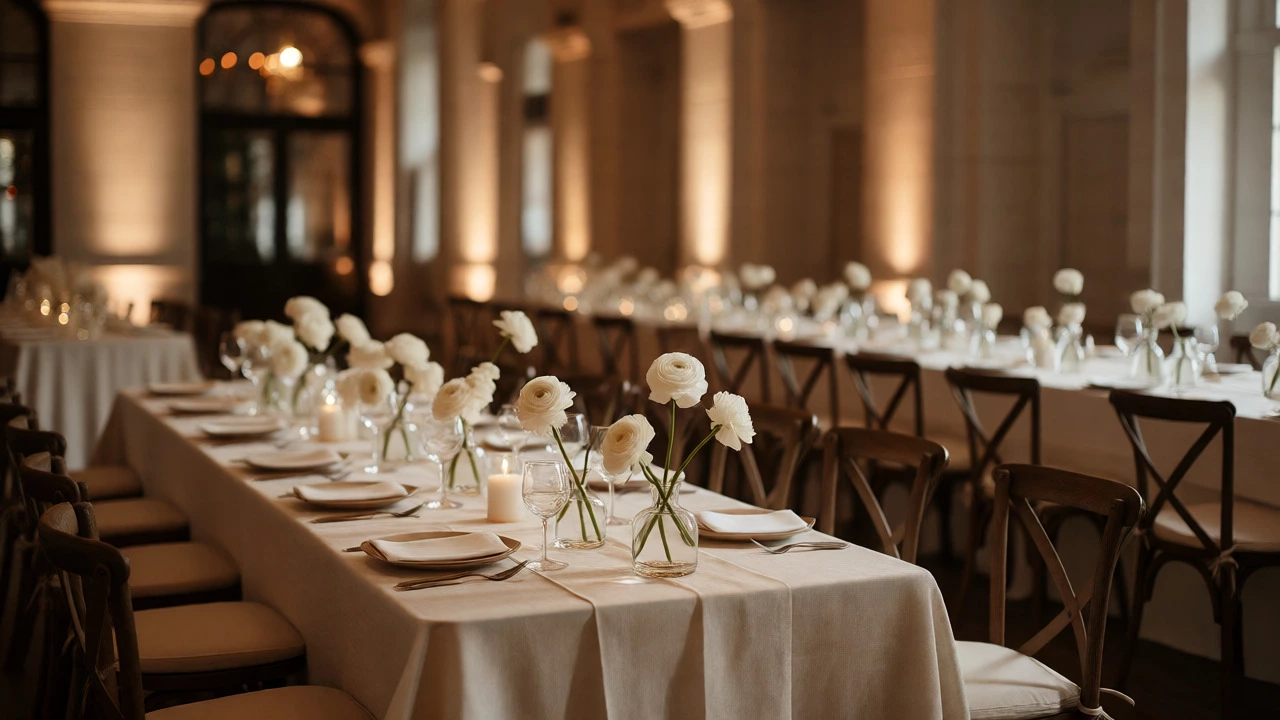
You walk into a venue. The lights are dim. There is no clutter. No plastic tablecloths screaming for attention. Just clean lines, soft textures, and an atmosphere that feels expensive without costing your entire mortgage. That feeling? That’s classy. It isn’t about throwing money at the problem; it’s about restraint.
Most couples make the mistake of thinking "more" equals "better." They pile on centerpieces until guests can’t see each other across the table. They choose bright, clashing colors because they saw it on Pinterest. But true elegance is quiet. It whispers. If you want your wedding to look timeless rather than trendy, you need to shift your mindset from decorating to curating.
The Power of Restraint in Design
Let’s be honest: visual noise kills elegance. When every surface is covered, the eye doesn’t know where to rest. This creates fatigue, not beauty. To achieve a classy look, you must embrace negative space. Think of your tables as canvases, not storage units.
A common trap is the "everything bagel" approach to florals. You don’t need three different types of flowers in every arrangement. Pick one or two focal blooms and let them breathe. For example, instead of mixing roses, lilies, carnations, and baby’s breath, try using just white ranunculus or deep red dahlias. The uniformity looks intentional and high-end. It signals confidence. You aren’t trying to impress everyone with variety; you’re making a statement.
This principle applies to color palettes too. Stick to monochromatic schemes or analogous colors (colors next to each other on the wheel). A palette of navy, slate, and silver looks far more sophisticated than a mix of purple, orange, and green. When you limit your choices, you reduce the risk of mismatched tones under harsh venue lighting.
Textiles and Tablescapes Matter More Than You Think
If there is one area where cheapness shows up instantly, it’s the table linens. Crinkled polyester sheets that slide around when someone pulls out a chair? Instantly downgrades the vibe. Classy weddings rely on weight and drape. Linen, cotton blends, or high-quality satin have a way of falling naturally that synthetic fabrics lack.
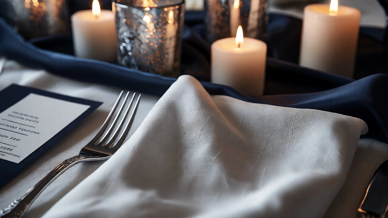
Consider the texture. A smooth silk runner might look sleek, but pairing it with a textured linen napkin adds depth. This contrast keeps the table interesting without adding clutter. And please, iron those napkins. Or better yet, use a fabric that resists wrinkling. Nothing says "we didn't plan this well" like a creased dinner napkin sitting on a $50 plate.
Placement is key here. Don’t overload the place setting. Three forks and two spoons are fine if you’re serving a formal five-course meal. But if you’re doing a buffet or family-style service, keep it simple. One fork, one knife, one spoon. Let the food speak. If you do go formal, ensure the silverware is polished. Tarnished cutlery reflects poorly-literally and figuratively.
| Element | Cluttered Approach | Classy/Elegant Approach |
|---|---|---|
| Centerpieces | Tall, mixed bouquets blocking view | Low, single-variety arrangements or floating candles |
| Linens | Bright patterns, slippery polyester | Solid neutrals, natural fibers like linen or cotton |
| Candles | Plastic LED tea lights everywhere | Real wax tapers or pillar candles in glass holders |
| Signage | Handwritten cardboard with glitter glue | Calligraphy on heavy cardstock or acrylic stands |
Lighting Sets the Mood
You can have the most beautiful flowers in the world, but if they are lit by fluorescent overhead tubes, they will look dull. Lighting is the invisible decorator. It changes how we perceive color and texture. For a classy aesthetic, you want warm, ambient light. Avoid cool, blue-toned bulbs which can make skin look pale and food look unappetizing.
String lights are popular, but often done poorly. If you hang them randomly, they look like a backyard barbecue. Instead, weave them through trees or drape them in structured swags. Better yet, use uplighting. Placing small spotlights at the base of pillars or walls casts a soft glow upward, highlighting architectural features. This adds drama without physical objects.
Candles remain the gold standard for intimacy. Real candles flicker; LEDs just blink. That subtle movement draws people in. Use varying heights. Group candles together in clusters of odd numbers (three, five, seven). Place them in glass hurricanes or mercury glass votives to protect the flame and add a reflective element. Just check your venue’s fire safety rules first. Some historic venues ban open flames entirely, so invest in high-quality LEDs with realistic wicks if necessary.
Floral Choices: Quality Over Quantity
Flowers are usually the biggest decoration budget line item. Here is a secret: exotic flowers cost more but often last longer and look more distinct. Peonies are beautiful but seasonal and fragile. Ranunculus or garden roses offer similar volume with better durability.
Greenery is your best friend for creating lushness on a budget. Eucalyptus, olive branches, or ferns fill space without the price tag of blooms. Mix textures. Combine broad leaves with delicate sprigs. This creates a wild, organic feel that looks effortless, even though it took hours to arrange.
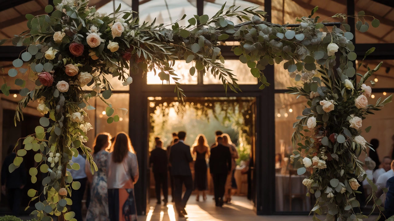
Don’t forget the entrance. First impressions matter. A grand floral arch sets the tone before guests even sit down. But again, avoid the "wall of flowers" trend if it overwhelms the architecture. Sometimes a single, perfectly placed large-scale installation near the bar or dance floor makes a bigger impact than covering every wall.
Personal Touches Without the Kitsch
Everyone wants their wedding to feel personal. But there is a thin line between "personal" and "cringe." Photo displays are great, but printing hundreds of Polaroids and clipping them to strings can look messy. Instead, frame a few significant photos in matching frames. Or hire a sketch artist to draw live portraits of guests during cocktail hour. It’s interactive, memorable, and results in a classy takeaway gift.
Custom menus are nice, but skip the rhyming poems unless they are genuinely funny. Clean typography on high-quality paper stock speaks volumes. Use serif fonts for headings and sans-serif for body text. Keep the layout airy. White space on the menu mirrors the white space on the table.
Music matters, too. A string quartet playing modern pop songs adds a layer of sophistication that a DJ blasting top 40 hits might miss early in the evening. Transition smoothly from acoustic sets during dinner to higher energy later. The auditory experience contributes significantly to the overall perception of class.
Practical Steps to Achieve Elegance
So, how do you actually execute this? Start with a mood board, but edit it ruthlessly. Delete anything that feels "busy." Then, create a checklist focused on materials, not just items.
- Material Audit: Check every item. Is it plastic? Replace it. Is it shiny vinyl? Swap it for matte finishes.
- Color Test: Order samples of linens and flowers. View them under low light. Colors look different at night.
- Vendor Coordination: Tell your florist and rental company exactly what you want. Show them photos of specific styles, not just "pretty flowers." Ask for mockups.
- Declutter Day-of: Assign a person to remove empty bottles and plates promptly. Visual clutter accumulates fast during dinner.
Remember, classy isn’t about perfection. It’s about intentionality. If you drop a napkin, pick it up. If a flower wilts, replace it. But never compromise on the core elements that define your aesthetic. Stay true to the vision of simplicity and quality.
What colors are considered classy for weddings?
Neutral tones like ivory, champagne, taupe, and gray are timeless. Deep jewel tones like emerald, navy, or burgundy also convey elegance when used sparingly against neutral backgrounds. Avoid neon or overly saturated primary colors, which can appear casual or dated.
How can I make my wedding look expensive on a budget?
Focus on lighting and textiles. Dimming overhead lights and using warm lamps or candles costs little but transforms a room. Invest in high-quality linens and real silverware rentals instead of plastic. Limit your color palette to two or three shades to create a cohesive, curated look that appears more luxurious than a chaotic mix.
Are fresh flowers necessary for a classy wedding?
Not necessarily, but they help. High-quality artificial flowers can work if they are realistic and arranged professionally. However, fresh flowers offer scent and texture that fake ones often lack. If budget is tight, use fewer, larger arrangements rather than many small ones. Greenery is also a cost-effective way to add volume and freshness.
What is the biggest mistake people make with wedding decor?
Over-decorating. Trying to fill every empty space leads to visual chaos. Another common error is ignoring lighting. Beautiful decor looks flat under harsh, bright lights. Always prioritize ambiance and negative space over quantity of items.
How do I choose a classy font for my invitations?
Stick to classic serif fonts like Baskerville, Garamond, or Times New Roman for traditional elegance. Script fonts should be legible; avoid overly curly or illegible calligraphy. Pair a decorative header font with a simple, readable body font. Ensure plenty of white space on the page.