Wedding Color Risk Analyzer
Select Your Bold Color
Visual Preview
Select options and click Analyze
Risk Assessment:
Analysis Results
Compatibility Score
Best Usage Strategy
Photography Tips
Styling Recommendations
White is safe. Blush pink is trendy. Navy blue is classic. But if you want a wedding that stops guests in their tracks and makes them ask, "Wait, what was that accent color?" you need to look at the bottom of the popularity charts. The least popular wedding color isn't just obscure; it's often misunderstood, feared, or simply overlooked by couples who play it safe.
Based on data from major floral networks like FTD and industry reports from The Knot and Zola over the last few years, black consistently ranks as the least chosen primary wedding color. While it appears frequently as an accent for gothic, modern, or high-contrast themes, very few couples build an entire palette around black. Close behind are neon shades and deep, muddy browns. These colors sit at the opposite end of the spectrum from the pastel pinks, sage greens, and soft blues that dominate Instagram feeds.
Why Black Is the Least Popular Wedding Color
Black carries heavy cultural baggage. In many Western traditions, it symbolizes mourning, funerals, or bad luck. For a day supposed to be about joy, light, and new beginnings, black can feel like a mismatch. This psychological barrier is the main reason it stays at the bottom of the list. Couples worry it will make their photos look dark, gloomy, or too serious.
However, this perception is shifting. Black is no longer just for vampires and rock stars. When paired correctly, it adds sophistication, drama, and depth. The key is balance. A pure black theme can indeed feel oppressive, but black used as a grounding element against bright whites, metallics, or vibrant blooms creates a striking visual contrast. Think of it like wearing a little black dress-it’s timeless because it provides a perfect canvas for other elements to shine.
| Color Category | Perception | Best Paired With | Risk Factor |
|---|---|---|---|
| Black | Dramatic, Sophisticated, Mourning | Gold, White, Red, Silver | Can look gloomy if not lit well |
| Neon Green/Pink | Fun, Energetic, Cheap-looking | Pastels, Metallics, Denim | Harsh in photographs |
| Muddy Brown | Earthy, Dull, Rustic | Burgundy, Cream, Olive | Lacks vibrancy |
| Blush Pink | Romantic, Soft, Trendy | Sage Green, Gold, White | Overused, lacks uniqueness |
The Case for Neon: The Other Unpopular Contender
If black is the quiet rebel, neon is the loud party crasher. Neon yellow, electric lime, and hot pink are rarely seen in formal weddings. Why? Because they are difficult to pull off without looking like a fraternity event or a rave. The human eye finds high-saturation colors stimulating, which is great for energy but terrible for relaxation and romance.
Yet, neon has a place. If you’re planning a summer festival wedding, a retro-themed reception, or a daytime beach bash, neon can work wonders. The trick is dilution. Don’t paint your walls neon. Use neon ribbons on clear glassware, neon lettering on signs, or small pops of neon flowers in bouquets. This approach gives you the edge and excitement of the color without overwhelming your guests’ senses.
Brown: The Overlooked Earth Tone
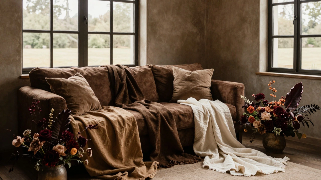
Green is huge. Sage, olive, and emerald are everywhere. But brown? Brown is often skipped. Couples associate brown with dirt, mud, or old wood. It doesn’t scream "celebration." However, brown is incredibly versatile when treated as a neutral rather than a statement color.
Think of chocolate brown, tan, and camel. These shades pair beautifully with burgundy for a fall wedding or with cream and gold for a warm, luxurious vibe. Brown grounds a palette. It adds warmth that cool grays and blues sometimes lack. By avoiding brown, many couples miss out on creating a cozy, intimate atmosphere that feels organic and natural.
How to Choose an Unpopular Color Without Regretting It
Picking a rare color is exciting, but it comes with risks. Here’s how to do it right:
- Test in Natural Light: Colors look different under sunlight versus indoor bulbs. Bring fabric swatches and flower samples outside. Black can look gray in dim light; neon can look blinding in direct sun.
- Use the 60-30-10 Rule: Let 60% of your decor be a neutral (white, cream, beige). Use 30% for your secondary color (maybe a soft green or blush). Reserve 10% for your bold, unpopular choice (black, neon, or brown). This ensures the space doesn’t feel chaotic.
- Consider Your Venue: A white-walled industrial loft handles black decor better than a rustic barn with wooden beams. A garden venue might clash with neon unless carefully controlled. Match the intensity of your color to the architecture of your space.
- Talk to Your Photographer: Show them your palette early. Some colors cause auto-white-balance issues in cameras. Black can absorb too much light, losing detail. Neon can cast colored reflections on skin tones. A pro photographer can adjust settings to keep your skin looking natural.
Real-Life Examples of Bold Choices
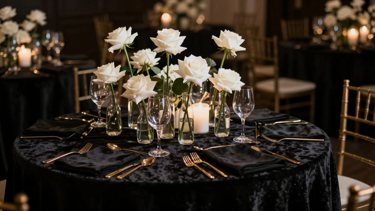
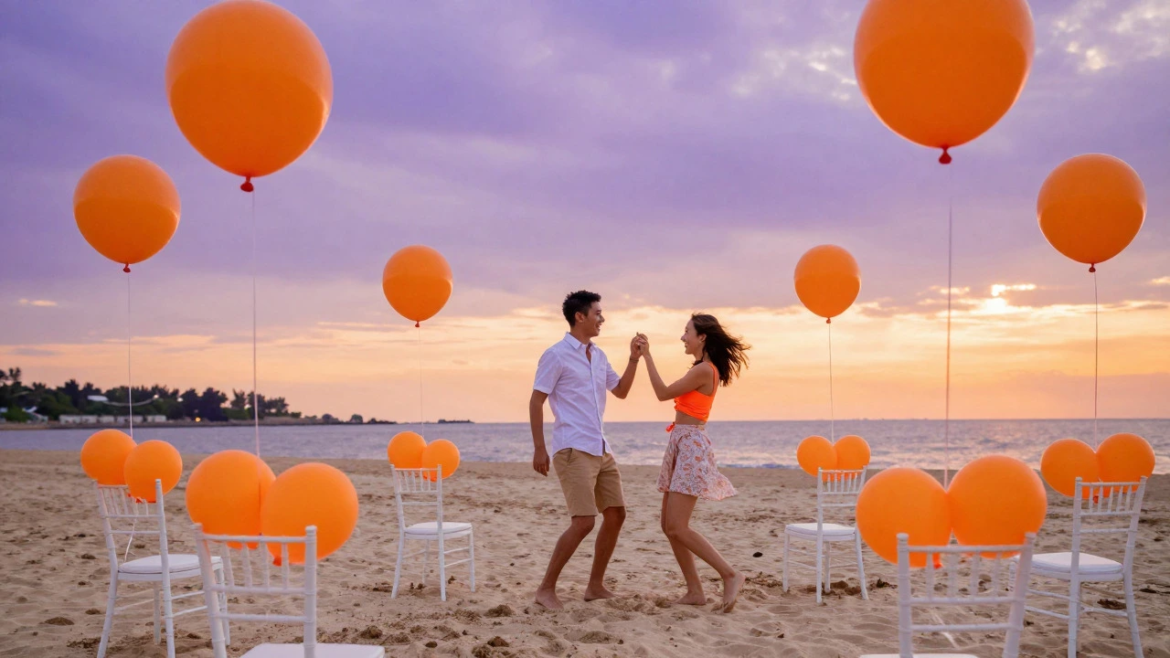
I’ve seen weddings where the couple went all-in on black tablecloths with gold cutlery and white roses. It looked elegant, not scary. Another couple used neon orange balloons tied to chairs at a sunset beach wedding. It felt playful and memorable. The common thread? Confidence. When you commit to a color, even an unpopular one, it reads as intentional design rather than a mistake.
Don’t let trends dictate your entire aesthetic. Trends fade. Your wedding photos will last forever. If you love the mystery of black, the energy of neon, or the warmth of brown, use them. Just use them wisely. The goal isn’t to shock people; it’s to create a visual experience that feels authentically you.
Is black bad luck for weddings?
No, black is not inherently bad luck. Superstitions vary by culture, but in modern Western weddings, black is seen as sophisticated and chic. Many celebrities and designers use black in their weddings without issue. It’s more about execution than superstition.
What colors go well with black for a wedding?
Black pairs beautifully with gold, silver, white, red, and emerald green. For a softer look, try pairing black with blush pink or lavender. Avoid pairing black with other dark colors like navy or deep purple unless you have excellent lighting, as it can become too monochromatic.
Are neon colors appropriate for formal weddings?
Generally, no. Neon colors tend to look casual and energetic, which clashes with formal attire and settings. However, you can incorporate subtle neon accents, like neon calligraphy on invitations or small neon flowers, to add a modern twist without breaking formality.
Why is brown so uncommon in weddings?
Brown is often associated with dirt or dullness, making it less appealing for celebratory events. However, rich shades like chocolate, caramel, and terracotta are gaining traction in rustic and autumnal weddings. They provide warmth and earthiness that cooler tones lack.
How can I use unpopular colors without overwhelming my guests?
Use the 60-30-10 rule. Keep the majority of your decor neutral. Use your unpopular color as an accent in small details like napkins, ribbons, or specific floral arrangements. This allows the color to pop without dominating the entire space.